Typography Text - Complete Guide
Learn how to add, edit, and style text in Scribe Animator. This guide covers the Text panel in the left sidebar, the Inspector properties on the right, and inline editing on the canvas.
Current visual orientation
Start in Text when you are creating content. Select the inserted object before using the canvas toolbar, Properties panel, animation controls, or outline conversion.
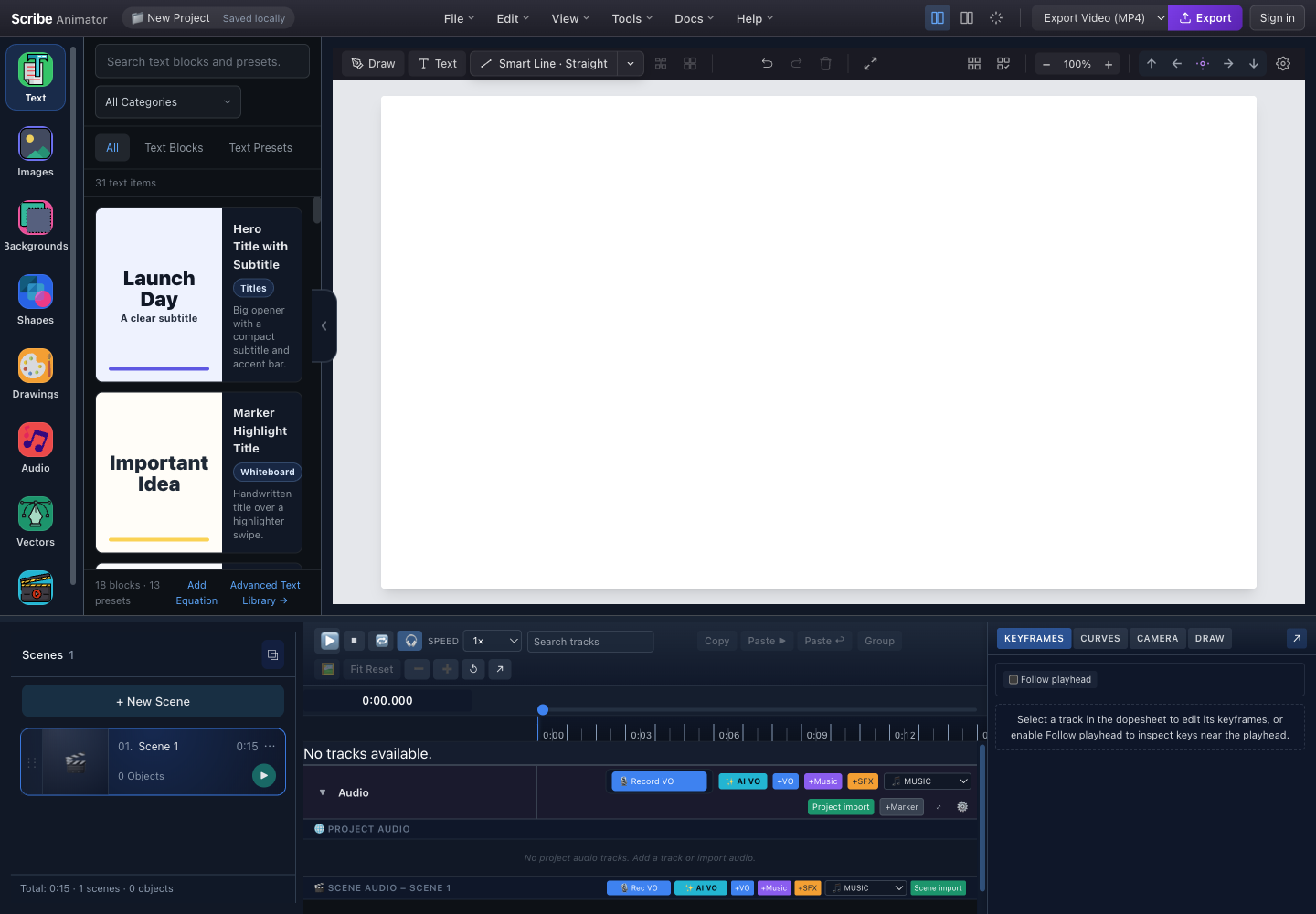
- Text libraryOpen blocks, presets, custom text, and the Desktop equation action.
- Search and categoryFind content by catalog metadata, then narrow it by purpose.
- Blocks and PresetsChoose a composition or a single pre-styled text object.
- Preview cardsSelect a real card to add its objects to the active scene.
- Custom and equation actionsUse custom text for exact wording and Add Equation for safe LaTeX-generated vectors.
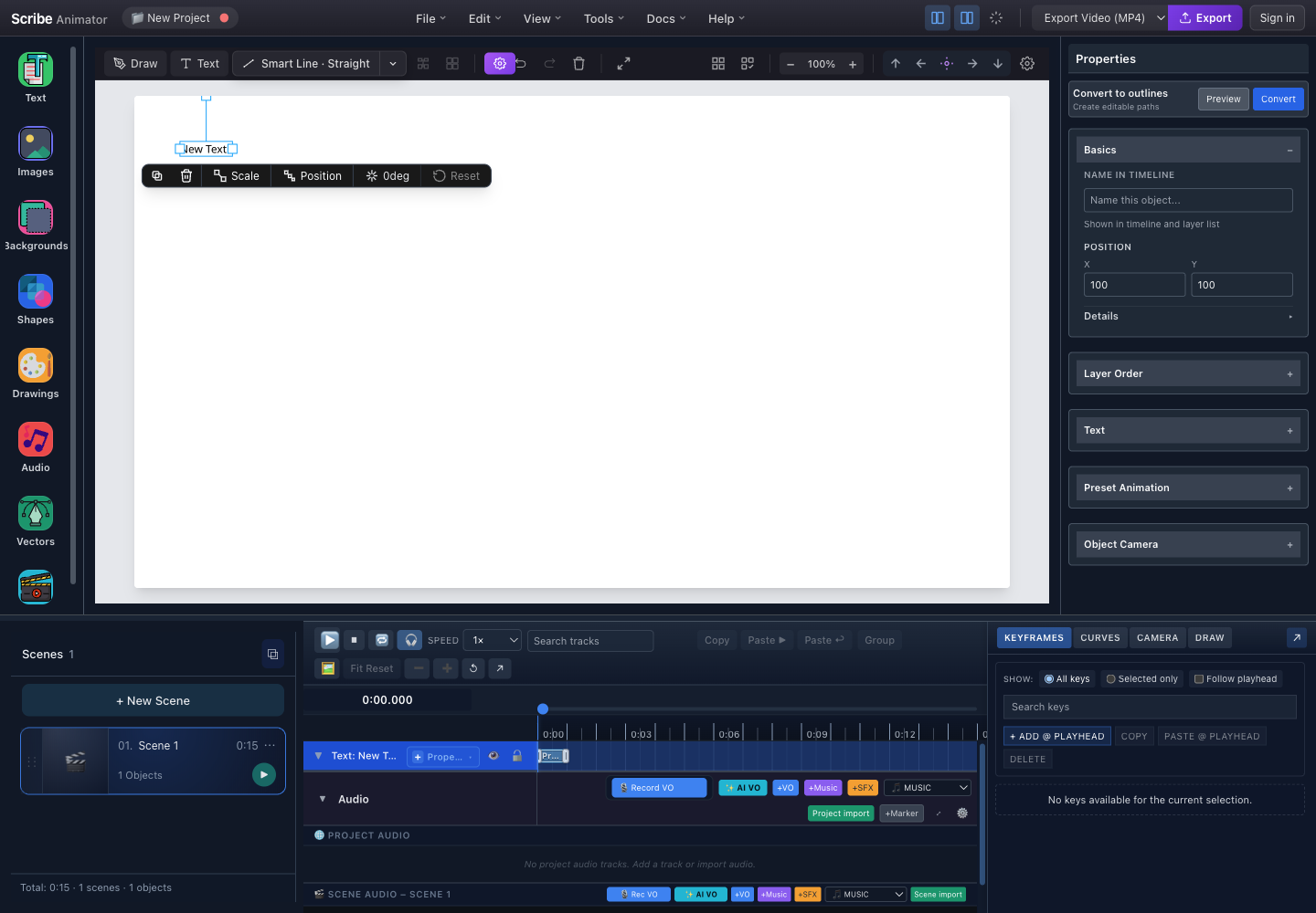
- Selected textSelection exposes handles and activates the object's inspector and timeline track.
- Contextual toolbarDuplicate, delete, scale, position, rotate, reset, or open the full text editor.
- Convert to outlinesPreview glyph paths first; conversion replaces editable text with vector geometry.
- Text propertiesExpand Text to edit content, theme, font, size, fill, alignment, spacing, and wrapping.
- Preset AnimationApply supported entrance behavior, including text-specific typewriter timing.
- Text timeline trackCoordinate object timing, property animation, and scene playback here.
These captures and control locations were checked against the running Desktop editor with browser-based UI review on July 27, 2026. The current catalog count is build-specific, and the header has no separate Share button. For the complete creation, editing, wrapping, animation, equation, script-assist, outline, and Mobile Lite workflows, follow Create text, typography, and equations.
Application Layout Overview
Use the authentic screenshots above as the layout reference. Text opens the library, the canvas shows and selects inserted objects, Properties edits the selected text, and the timeline controls when it appears and animates.
Text Feature Access Points:
- Left Sidebar → 📝 Text — Add text templates to canvas
- Right Sidebar → Inspector → Text Section — Edit selected text properties
- Canvas → Double-click text — Open full Text Properties Modal
Quick Start: Adding Text to Your Project
Method 1: Using Text Templates (Recommended)
- Open Text from the left rail.
- Search or choose a category when needed.
- Choose Text Blocks for a coordinated composition or Text Presets for one styled object.
- Select a real preview card.
- Confirm the resulting canvas selection and timeline track before editing.
Method 2: Canvas Toolbar
Click the "T" (Add Text) button in the canvas toolbar above the canvas area.
Using Text Templates is recommended for beginners — they come with pre-configured styles and positioning that follow typography best practices!
Left Sidebar: Text Panel
When you click the Text icon in the left sidebar, the Text Templates Library opens.
Text Panel Layout
| Library area | Purpose |
|---|---|
| Search and category | Finds catalog content by available metadata |
| Text Blocks | Adds a coordinated multi-object composition |
| Text Presets | Adds one styled text object |
| Preview cards | Shows what the selected catalog item will add |
| Custom text | Starts from exact wording without a preset |
| Equation | Opens the supported Desktop equation workflow |
Catalog contents and counts are build-specific; the screenshot above is the current source of truth.
Template Categories
| Category | Icon | Description | Example Use |
|---|---|---|---|
| Headings | 🔠 | Simple headline templates | Title slides, section headers |
| Body layouts | 📄 | Subheading + body text | Explanatory content |
| Quotes | 💬 | Centered quote formats | Testimonials, inspiration |
| Stats / Number blocks | 📊 | Large number with caption | Metrics, data points |
| Sale / Promotion layouts | 🏷️ | Promotional arrangements | Marketing, announcements |
| Labels / Badges | 🏷️ | Small badge-style text | Tags, callouts |
Search & Filter Options
| Control | What it searches or filters |
|---|---|
| Search | Available names, categories, tags, or preview copy indexed by the current catalog |
| Category | Narrows by the selected content purpose |
| All | Shows all available text content |
| Text Blocks | Shows coordinated layouts |
| Text Presets | Shows single styled text objects |
| Recent/Favorites | Appears only where the current library and account state support it |
Clearing search and filters restores the current loaded collection; it does not change the scene.
Favorites System
- Click the ⭐ icon on any template to add/remove from favorites
- Favorites sync across devices when signed in to your account
- Access favorites quickly via the ⭐ Favorites tab
Favorites sync requires an active internet connection. When offline, only local favorites are available.
Typography Themes
Themes control the default fonts, sizes, and styling for ALL text in your project.
Available Themes
| Theme | Typical face | Character | Useful for |
|---|---|---|---|
| Default Clean | Noto Sans | Modern and neutral | Business, technology, and general explainers |
| Elegant Serif | Noto Serif | Editorial and formal | Stories, quotations, and literary material |
| Warm / Human | Mukta | Friendly and approachable | Education, Devanagari/Hindi, and personal work |
Names and defaults can change by build. Use only themes visible in the current editor and verify complex-script coverage with the actual text.
How to Change Theme
Location: Left Sidebar → Text Panel → Theme dropdown (top of panel)
OR
Location: Right Sidebar → Inspector → Text Section → Theme dropdown
- Select a text object and expand its Text Properties section, or use the project text/theme control if the current library exposes it.
- Open the visible theme selector.
- Choose a theme and inspect every token-based text object.
- Reset or preserve deliberate per-object overrides.
- Undo or restore from a checkpoint if the project-wide result is not acceptable.
Changing theme updates ALL text elements that use style tokens. Text with custom overrides keeps its settings. This action cannot be undone in a single step — you'll need to manually reset any changes.
Set your project theme before adding text elements. This ensures all text uses consistent styling from the start!
Right Sidebar: Inspector Panel (Text Section)
When you select a text element on the canvas, the Inspector panel shows the Text section.
Inspector Text Section Layout
The annotated Properties screenshot above shows the current collapsed Text section. Expand it to find the fields supported by the selected object. Typical controls include content, theme/style, font, size, color, alignment, spacing, and wrapping; the running inspector is authoritative.
Properties Reference
| Property | Description | How to Use |
|---|---|---|
| Theme | Project-wide typography theme | Select from dropdown. Affects all style-token text. |
| Content | The actual text displayed | Type in textarea. Press Enter to commit. |
| Font Size | Text size in pixels (8–72px) | Drag slider or type value. |
| Fill Color | Text color | Click color box to pick, or type hex code. |
| Font | Typeface/font family | Select from dropdown menu. |
Available Fonts
| Family | Examples | Notes |
|---|---|---|
| Sans serif | Noto Sans, Noto Sans Devanagari, Mukta, Hind | General UI, body copy, and supported Devanagari text |
| Serif | Noto Serif, Noto Serif Devanagari, Tiro Devanagari Hindi | Editorial or formal tone |
| Handwritten/display | Kalam and build-specific display faces | Use sparingly and verify outlines before drawing |
Font availability, loading, glyph coverage, and outline conversion are separate concerns. A listed family does not guarantee every character can be converted.
All fonts are pre-loaded and optimized for SVG path conversion, which is required for the hand-drawing animation effect.
For Hindi/Devanagari content, use Mukta or Noto Sans Devanagari — they have excellent character support and rendering quality!
Advanced Text Properties (Full Modal)
For complete control over text styling, double-click any text element on the canvas.
How to Access
- Select the text on the canvas.
- Use the visible contextual Edit action or double-click only when the running build exposes the full editor.
- If Properties offers a More options action, it reaches the same supported editor.
- Close with its visible close action or Escape, then verify the canvas result.
Do not infer a modal from older documentation when the current build exposes only inline Properties controls.
Text Properties Modal Layout
When the full text editor is available, it can group these controls:
| Group | Controls |
|---|---|
| Content and wrapping | Text value, manual line breaks, word/character wrapping, single-line behavior |
| Style token | Named token, override indicator, and Reset to style |
| Typeface | Font family, weight, size, italic, and underline when supported |
| Color and alignment | Fill color plus left, center, or right alignment |
| Spacing | Line height and letter spacing within their current input boundaries |
The current visible controls and values take precedence over the historical modal sketch.
All Properties Reference
| Property | Description | Range/Values |
|---|---|---|
| Text Content | The displayed text | Any text, multiline supported |
| Wrapping | How text wraps | Auto (word), Auto (char), Single line |
| Style | Pre-defined style token | See Style Tokens table below |
| Font Family | Typeface | See Available Fonts list |
| Font Weight | Boldness | 100 (Thin) to 900 (Black) |
| Font Size | Size in pixels | 8px to 72px |
| Text Color | Fill color | Hex code (e.g., #FF5500) |
| Font Style | Italic toggle | Normal / Italic |
| Text Decoration | Underline toggle | None / Underline |
| Text Alignment | Horizontal align | Left / Center / Right |
| Line Height | Line spacing | 0.8 to 3.0 |
| Letter Spacing | Character spacing | -5px to 20px |
Use Line Height of 1.4–1.6 for body text to improve readability. Headings can use tighter spacing (1.0–1.2).
Extreme values for Letter Spacing (below -3px or above 10px) can make text difficult to read. Use sparingly for special effects only.
Style Tokens System
Style tokens provide consistent typography across your project. They inherit values from the current theme.
Available Style Tokens
| Token | Reference size | Typical use |
|---|---|---|
| heading-xl | 72 px | Main title or hero copy |
| heading-lg | 56 px | Major section heading |
| heading-md | 40 px | Subsection heading |
| heading-sm | 28 px | Card title or label |
| body-lg | 24 px | Lead or emphasized body copy |
| body-md | 18 px | Regular paragraph text |
| body-sm | 14 px | Secondary copy |
| caption | 12 px | Annotation, footnote, or credit |
These are reference defaults. The selected theme and current source contracts determine effective values.
How Style Tokens Work
A theme defines values for named style tokens. A token-based text object inherits those values. Changing the project theme updates inherited values, while explicit object overrides remain different until Reset to style is used.
Overrides
When you customize a property on text that uses a style token:
| State | Font | Size | Indicator |
|---|---|---|---|
| Token inherited | Theme-provided, for example Noto Sans | Token-provided, for example 56 px | No override warning |
| Object override | Explicit per-object choice, for example Mukta | Other token fields can remain inherited | Overrides active when supported |
Use Reset to style to remove supported overrides and restore the token values.
Style tokens are the recommended way to maintain consistent typography. When you need custom styling, apply overrides sparingly to specific elements rather than modifying the theme itself.
Text Wrapping Options
Control how text flows within its bounding box.
| Wrapping mode | Behavior | Best use |
|---|---|---|
| Auto (word) | Wraps at word boundaries | Paragraphs and readable body copy |
| Auto (characters) | Can break between characters | Narrow technical labels or scripts that require character wrapping |
| Single line | Does not wrap and can extend horizontally | Headlines, badges, and short labels |
Verify the rendered text at the intended canvas size. Single-line copy can leave the visible frame.
When using Single Line mode for headlines, make sure your canvas is wide enough to accommodate the full text — otherwise text may extend beyond visible area!
Editing Text on Canvas
Selection & Transformation
When text is selected:
- drag inside the bounds to move it;
- use corner handles to resize according to the active text/scale behavior;
- use the rotation control when exposed;
- use the contextual toolbar or Properties for precise values;
- open the supported text editor to change copy and typography; and
- press Delete only after confirming the intended selection.
Quick Edit Flow
- Select the text object.
- Open its supported edit surface from the contextual toolbar, Properties, or double-click behavior.
- Change the required content or style.
- Close the editor and verify the canvas and timeline result.
- Use Undo immediately if the wrong object changed.
Editor changes update project state, but that does not replace an explicit backup or portable save.
All text changes are auto-saved. There's no manual save required — your work is preserved automatically!
Convert Text to Vector Outlines
Use outline conversion when a drawing workflow needs glyph geometry instead of live font text. Keep the object as text while you are still changing copy, font, wrapping, or typography. Conversion is a one-way type change in the project state: after it completes, the selected object is a vector path and the Text controls no longer apply.
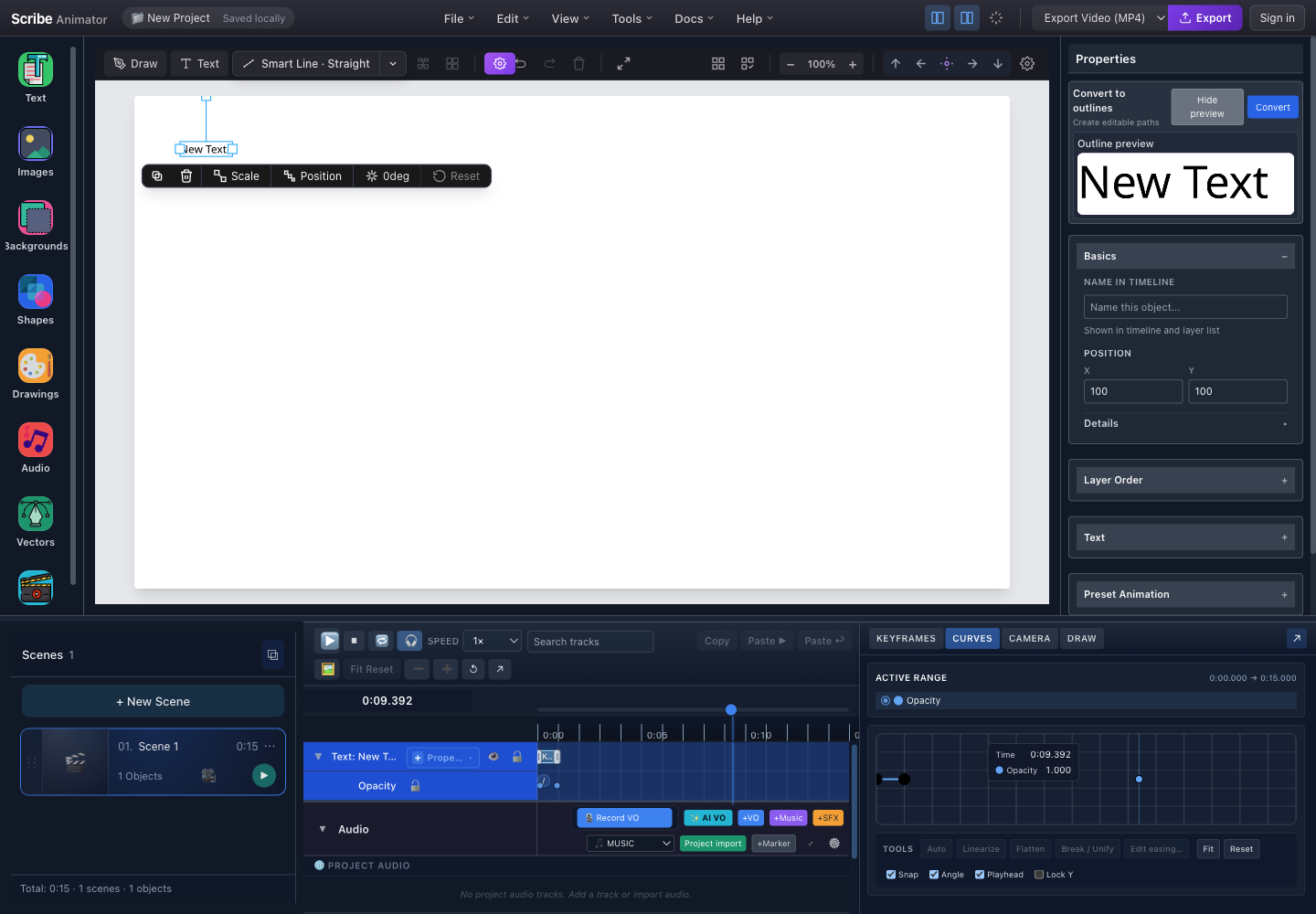
- Editable textThe selected object is still live text at this point.
- Glyph-path previewInspect the actual outline result before replacing the text object.
- ConvertCommit only after the preview is complete and readable.
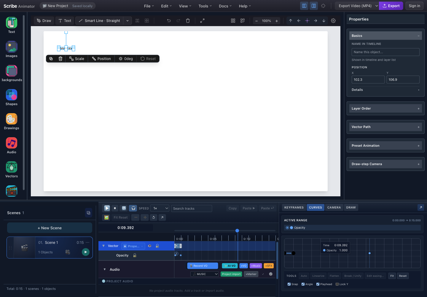
- Vector selectionThe canvas now selects path geometry, not an editable text object.
- Vector Path propertiesThe inspector exposes vector controls; the Text section is no longer present.
- Vector timeline trackThe timeline identifies the converted object as Vector.
- Finish and proofread the text.
- Duplicate it if later copy edits may be required.
- Select the live text and open Convert to outlines.
- Inspect the outline preview for missing glyphs, clipping, or an unexpected font.
- Select Convert.
- Confirm the inspector shows Vector Path and the timeline identifies the object as Vector.
- Create or review the draw plan, then preview the animation.
Use Undo immediately if the conversion result is wrong. Do not describe or treat the converted vector as editable text.
Text Animation
Text elements can be animated like any other object.
Animation Types for Text
| Animation | Result | Important boundary |
|---|---|---|
| None/instant | Text is present without an entrance | Label can vary by build |
| Fade/entrance preset | The whole object enters with the selected preset | Availability depends on the object and preset |
| Typewriter | Characters are revealed over time | Verify script segmentation and scene duration |
| Draw/reveal | Outlined vector geometry is drawn over time | Requires outline conversion or eligible paths and a valid draw plan |
Draw behavior does not make editable font text and vector outlines the same object type.
The Draw animation type creates the signature whiteboard effect. Use it for headlines and key messages to maximize impact!
Outline conversion replaces live text with vector paths. Long text and complex fonts can produce much more geometry and take longer to process or draw. Keep copy concise, inspect the preview, and preserve a live-text duplicate when future edits are likely.
Animation Properties
| Property | Description | Location |
|---|---|---|
| Animation Type | Effect to use | Inspector → Animation section |
| Start Time | When animation begins (seconds) | Inspector → Animation section |
| Duration | How long animation takes | Inspector → Animation section |
| Easing | Acceleration curve | Inspector → Animation section |
Easing Options
| Easing | Motion profile |
|---|---|
| Linear | Constant rate |
| Ease in | Starts slowly and accelerates |
| Ease out | Starts quickly and decelerates |
| Ease in-out | Accelerates, then decelerates |
Preview the animation; the same easing can feel different at different durations.
Keyboard Shortcuts
| Shortcut | Action |
|---|---|
Double-click | Open Text Properties Modal |
Escape | Close modal / Deselect |
Delete or Backspace | Delete selected text |
⌘C / Ctrl+C | Copy selected text |
⌘V / Ctrl+V | Paste text |
⌘D / Ctrl+D | Duplicate selected text |
⌘Z / Ctrl+Z | Undo |
⌘⇧Z / Ctrl+Shift+Z | Redo |
Arrow keys | Nudge selected text (1px) |
Shift + Arrow keys | Nudge selected text (10px) |
Validation Rules
The current Properties editor uses these source-defined boundaries:
| Property | Current boundary | Practical effect |
|---|---|---|
| Font size | 8–72 px | Values entered through the Properties control are clamped to this range |
| Animation start | 0 seconds minimum | An object cannot begin before its scene |
| Animation duration | 0.1 seconds minimum | Zero-length preset animations are not accepted by the numeric control |
| Fill color | Browser color input | The inspector commits the browser control's hexadecimal color value |
| Text commit | Blur, or Enter without Shift | Use Shift+Enter when you need a manual line break in the Properties textarea |
Text length, line count, CSS color syntax, and a fixed 60-second animation maximum are not documented compatibility limits in the current editor source. For very long copy, split content into multiple objects and verify wrapping, scene duration, and export readability instead of relying on an undocumented threshold.
If animation start time + duration exceeds project length, the animation will be cut off at the end of the project. Ensure your timing fits within the project timeline!
Best Practices
Typography Guidelines
Do:
- choose the project theme before extensive styling;
- use style tokens for consistent hierarchy;
- limit the font palette;
- maintain strong foreground/background contrast;
- allow enough scene time to read the copy; and
- keep motion purposeful.
Avoid:
- using display-heading sizes for body copy;
- mixing many unrelated typefaces;
- using color as the only meaning cue;
- animating every text object; and
- using Single Line for paragraphs.
Create a style guide for your project: decide on 2-3 heading sizes and 1-2 body sizes before you start. Consistency is key to professional-looking videos!
Performance Tips
- Avoid excessive text elements (can slow rendering)
- Group related text that animates together
- Use appropriate sizes for content type
- Consider using templates for common layouts
Troubleshooting
Common Issues
| Problem | Possible Cause | Solution |
|---|---|---|
| Text appears blurry | Zoom level not 100% | Set zoom to 100% |
| Font not showing | Font still loading | Wait a moment, refresh if needed |
| Animation not working | Type set to "None" | Change animation type in Inspector |
| Theme not applying | Text has overrides | Click "Reset to style" button |
| Text too small/large | Wrong style token | Select appropriate heading/body style |
| Can't find text panel | Sidebar collapsed | Click 📝 icon in left sidebar |
Reset Text to Default
- Select the text object.
- Open the supported text editor or expanded Text Properties section.
- Choose the intended style token, such as body-md.
- Select Reset to style when that action is available.
- Verify that the override indicator clears and the expected theme values return.
Summary: Where to Find Everything
| Goal | Current workflow |
|---|---|
| Add catalog text | Open Text, choose Blocks or Presets, then select a card |
| Add exact copy | Use Custom text or the canvas text action |
| Edit content | Select the object and use its contextual or Text Properties editor |
| Change font, size, color, or wrapping | Expand the selected object's Text section |
| Change project theme | Use the visible theme control and review all token-based text |
| Animate text | Use the selected object's supported Animation controls |
| Draw text | Convert to outlines when supported, create a draw plan, and preview |
| Add an equation | Use the Desktop equation action and verify the generated vector |
Questions? Check out our Documentation or visit app.ohotech.com to start creating!