Background & Canvas Settings - Complete Guide
Learn how to configure your canvas dimensions, choose board styles, and customize background colors in Scribe Animator. This guide covers the Canvas Settings panel accessible from the toolbar.
Visual orientation
Canvas size and board style live in Canvas Settings. Reusable image, gradient, and solid presets live in the separate Background Library.
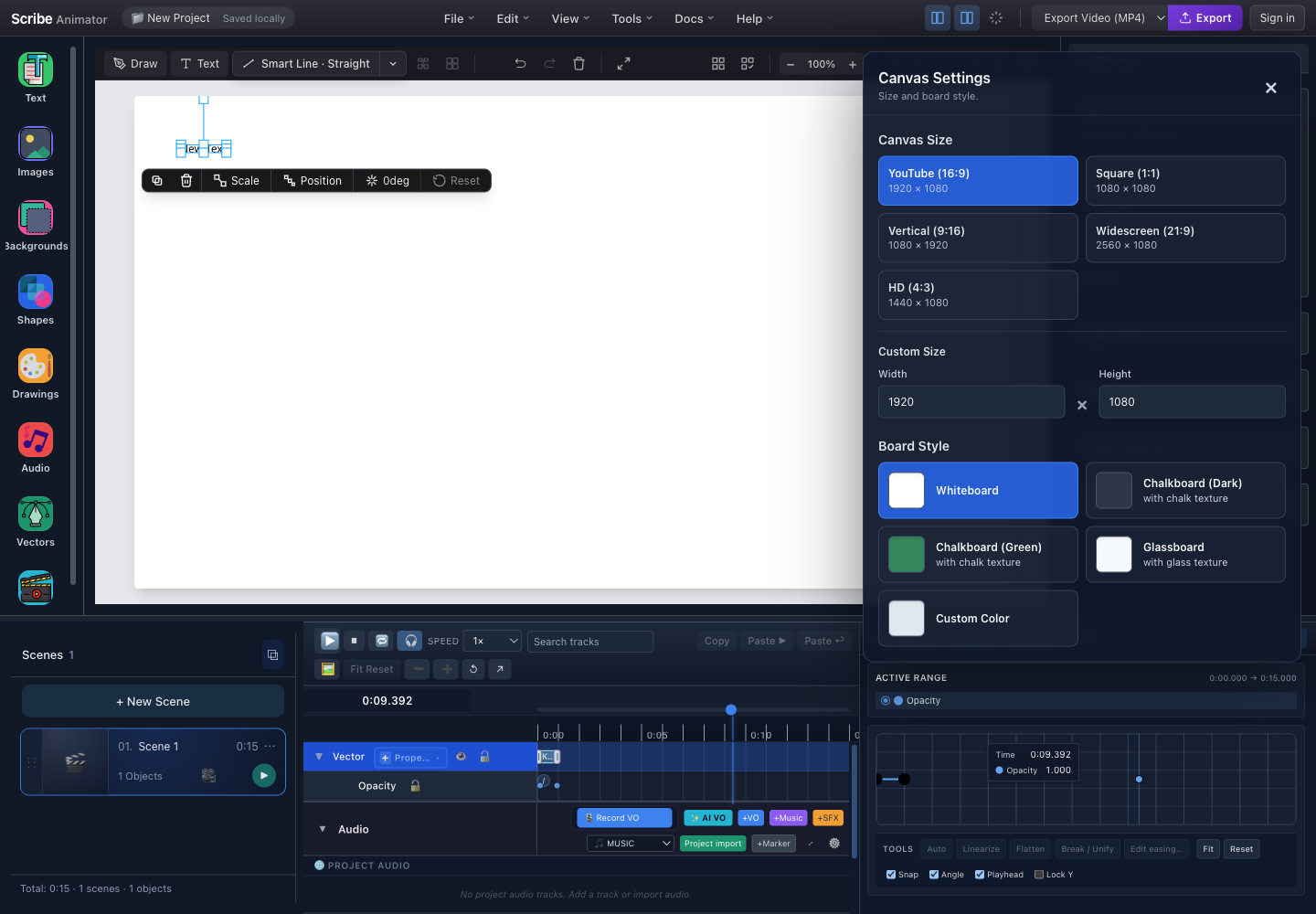
- Canvas SettingsThis panel owns canvas dimensions and base board style.
- Canvas-size presetsChoose a named aspect ratio such as YouTube, Square, Vertical, Widescreen, or HD.
- Custom dimensionsEnter an explicit width and height when a preset does not match the delivery surface.
- Board styleChoose the base whiteboard, chalkboard, or glassboard treatment.
- Custom ColorChoose a project-specific solid board color when the named styles do not fit.
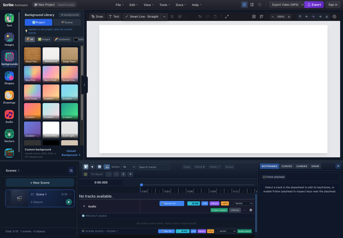
- BackgroundsOpen the library from the left rail.
- Project or SceneChoose whether the selected background should affect the project context or only the active scene.
- Background filtersNarrow presets by all items, images, gradients, or solid fills.
- Preset gridChoose a visible card to apply that background to the selected scope.
- Upload BackgroundUse a local JPEG, PNG, or GIF when the preset library does not contain the required art.
Both captures and their control locations were checked against the running desktop editor with browser-based UI review on July 27, 2026. The current header has Export but no separate Share control. For the task-based workflow, follow Add images, assets, and backgrounds.
Application Layout Overview
Use the authentic screenshots above as the layout reference. Canvas Settings opens from the canvas toolbar and controls dimensions and board treatment. Backgrounds opens from the left rail and controls reusable project- or scene-level background assets. The central canvas previews the result immediately.
Canvas Settings Access:
- Canvas Toolbar → ⚙️ Settings — Opens the Canvas Settings panel
Quick Start: Opening Canvas Settings
Method 1: Toolbar Button (Recommended)
- Locate the gear in the canvas toolbar.
- Select it once to open Canvas Settings.
- Confirm the panel title before changing dimensions or board style.
- Drag the panel by its header when it obscures the canvas.
- Press Escape or use the close button when finished.
Method 2: Keyboard Shortcut
Press Escape to close the panel when open.
The Canvas Settings panel is draggable! Click and drag the header to reposition it anywhere on screen without blocking your canvas work.
Canvas Settings Panel
When you click the ⚙️ Settings button, the Canvas Settings panel appears.
Panel Layout Overview
| Panel section | Purpose |
|---|---|
| Canvas-size presets | Apply a named output aspect ratio and dimensions |
| Custom size | Enter explicit width and height values |
| Board style | Choose Whiteboard, Chalkboard, Glassboard, or Custom Color when offered |
| Custom background color | Set a hex color after selecting Custom Color |
| Advanced | Development-only processing controls; absent in production builds |
The annotated complete Canvas Settings capture above is the source of truth for the visible controls.
Canvas Size Presets
Choose from popular aspect ratios optimized for different platforms.
Available Presets
| Preset | Dimensions | Aspect Ratio | Best For |
|---|---|---|---|
| YouTube (16:9) | 1920 × 1080 | 16:9 | YouTube, Vimeo, standard video |
| Square (1:1) | 1080 × 1080 | 1:1 | Instagram posts, social media |
| Vertical (9:16) | 1080 × 1920 | 9:16 | TikTok, Instagram Reels, Stories |
| Widescreen (21:9) | 2560 × 1080 | 21:9 | Cinematic presentations |
| HD (4:3) | 1440 × 1080 | 4:3 | Traditional presentations |
Preset Selection Visual
Selecting a preset updates both dimensions and aspect ratio immediately. Use the table above to compare presets, then verify the canvas boundary before placing content. The named presets and displayed values in the running build take precedence over older diagrams.
Choose your canvas size before adding content. Changing dimensions after adding objects may require repositioning elements.
The YouTube (16:9) preset at 1920×1080 is the most versatile choice for standard video content and online tutorials.
Custom Canvas Size
For specific requirements, enter custom width and height values.
Custom Size Input
| Field | Meaning | Validation |
|---|---|---|
| Width | Horizontal canvas pixels | 100–7680 px |
| Height | Vertical canvas pixels | 100–4320 px |
Changes apply immediately. Confirm that existing objects still sit inside the new boundary.
Custom Size Workflow
- Open Canvas Settings.
- Enter the required width and height.
- Confirm that each value remains within the supported range.
- Inspect the live canvas boundary and reposition existing objects when necessary.
Setting very large canvas sizes (e.g., 4K at 3840×2160) may impact performance on slower devices. Recommended maximum is 1920×1080 for smooth editing.
Validation Rules
| Property | Minimum | Maximum | Default |
|---|---|---|---|
| Width | 100 px | 7680 px | 1920 px |
| Height | 100 px | 4320 px | 1080 px |
Board Styles
Board styles define the visual appearance and texture of your canvas background.
Available Board Styles
| Style | Color | Texture | Use Case |
|---|---|---|---|
| Whiteboard | #ffffff | None | Clean, professional presentations |
| Chalkboard (Dark) | #2d3748 | Chalk | Educational, retro classroom feel |
| Chalkboard (Green) | #2f855a | Chalk | Classic school chalkboard look |
| Glassboard | #f7fafc | Glass | Modern, sleek corporate style |
| Custom Color | User-defined | None | Full customization |
Board Style Visual Comparison
| Style | Base appearance | Texture | Typical use |
|---|---|---|---|
| Whiteboard | White | None | Clean presentations and general explainers |
| Chalkboard (Dark) | Dark gray | Chalk | Classroom or retro treatment |
| Chalkboard (Green) | Green | Chalk | Traditional school-board treatment |
| Glassboard | Very light | Glass | Modern, polished presentation |
| Custom Color | User-selected hex | None | Brand or campaign color |
The Canvas Settings screenshot proves the selectors. Preview the actual canvas to judge color and texture; text descriptions are not a substitute for the rendered result.
Whiteboard is perfect for most use cases. Use Chalkboard styles when creating educational content with a classroom feel.
Custom Background Color
When you select Custom Color as the board style, additional color controls appear.
Color Picker Interface
After selecting Custom Color, use the visible color swatch for a system picker or type a supported hex value in the adjacent field. The canvas updates immediately.
Color Input Methods
| Method | Steps | Best for |
|---|---|---|
| Visual picker | Select the swatch, choose a color, close the system picker | Exploration |
| Hex input | Enter a 3- or 6-digit hex value such as #f00 or #3b82f6 | Exact brand colors |
RGB, HSL, and named colors are not accepted by this field.
Popular Background Colors
| Color | Hex Code | Use Case |
|---|---|---|
| Pure White | #ffffff | Clean, minimal |
| Light Gray | #f3f4f6 | Soft, professional |
| Cream | #fef3c7 | Warm, inviting |
| Navy Blue | #1e3a5f | Corporate, serious |
| Dark Gray | #1f2937 | Dark mode, cinematic |
| Pastel Blue | #dbeafe | Calm, educational |
Changes apply immediately as you pick colors. There's no Apply button — what you see is what you get!
Color Format Validation
| Format | Valid | Example |
|---|---|---|
| 6-digit hex | ✅ Yes | #3b82f6 |
| 3-digit hex | ✅ Yes | #f00 |
| RGB | ❌ No | rgb(59, 130, 246) |
| Named colors | ❌ No | blue |
Only hex color codes are supported. RGB, HSL, and named colors will not work. Use a hex converter if needed.
Settings Persistence
All canvas settings are automatically saved to your project.
What Gets Saved
| Project field | Example | Purpose |
|---|---|---|
| Width | 1920 | Canvas width in pixels |
| Height | 1080 | Canvas height in pixels |
| Board style | Custom | Selected base treatment |
| Background color | #3b82f6 | Custom color when applicable |
These values belong to project state; exact serialized field names are an internal contract and may differ from the labels shown in the editor.
Settings Lifecycle
Settings follow this lifecycle:
- A visible panel action updates the active project.
- The canvas previews the new project state.
- Supported persistence saves that state with the project.
- Reopening the same saved project restores it.
A local preview is not proof that an account-library or portable package save has completed. Use the intended save workflow.
Settings are saved to your project file. When you export and share your project, recipients will see the same canvas size and background you configured.
Advanced Settings (Debug Mode)
In development mode, additional advanced options are available.
Vector Processor Worker
The development-only Advanced section can expose a vector-processor worker switch used to compare background-worker and synchronous processing. It is a debugging control, not an end-user performance recommendation, and regular production builds do not show it.
Advanced settings are only visible in development mode (non-production builds). Regular users won't see these options.
Panel Interaction
Dragging the Panel
Drag only the panel header. Controls inside the panel remain interactive and do not act as a drag handle. Keep the panel within the viewport, then use the live canvas to verify changes. If a stored position leaves it off-screen, reload only after saving the project.
Closing the Panel
| Method | Action |
|---|---|
| × button | Click the close button in the header |
| Escape key | Press Esc anywhere while panel is open |
| Click outside | Not supported (panel is non-modal) |
The panel is non-modal — you can interact with the canvas while the settings panel is open. This allows real-time preview of your changes!
Keyboard Shortcuts
| Shortcut | Action |
|---|---|
Escape | Close the Canvas Settings panel |
Common Workflows
Workflow 1: Set Up for YouTube Video
- Open Canvas Settings.
- Choose YouTube (16:9) and verify 1920 × 1080 in the running build.
- Choose Whiteboard.
- Inspect text and artwork against the live canvas before export.
Workflow 2: Create Educational Chalkboard Video
- Open Canvas Settings.
- Choose the required aspect ratio, commonly YouTube (16:9).
- Select Chalkboard (Green) or Chalkboard (Dark).
- Change foreground colors for readable contrast, then preview the scene.
Workflow 3: Create Instagram Reel
- Open Canvas Settings.
- Choose Vertical (9:16) and verify 1080 × 1920 in the running build.
- Select Custom Color only when a brand background is required.
- Keep essential content inside the vertical safe area and preview before export.
Troubleshooting
Panel Not Opening
| Issue | Solution |
|---|---|
| Settings button not visible | Ensure you're in the main editor view, not preview mode |
| Panel appears off-screen | Refresh the page; panel position resets on reload |
Color Changes Not Applying
| Issue | Solution |
|---|---|
| Custom color not visible | Ensure "Custom Color" board style is selected |
| Hex code not working | Use format #RRGGBB (e.g., #3b82f6), not RGB |
Canvas Size Issues
| Issue | Solution |
|---|---|
| Objects outside canvas | Manually reposition objects after resizing |
| Performance slow | Reduce canvas size; 1920×1080 is optimal |
Changing canvas size does not automatically reposition existing objects. You may need to manually adjust element positions after resizing.
Best Practices
Choosing Canvas Size
- Decide platform first — YouTube, Instagram, TikTok have different requirements
- Use presets when possible — They're optimized for common use cases
- Set size before adding content — Avoid repositioning work later
Choosing Board Style
- Match your content — Educational → Chalkboard, Corporate → Whiteboard/Glassboard
- Consider text contrast — Dark backgrounds need light text colors
- Test before committing — Preview your animation with the chosen style
Custom Colors
- Use brand colors — Maintain visual consistency with your brand
- Ensure contrast — Text and graphics should stand out from background
- Test on different displays — Colors may appear differently on various screens
Pro tip: Save your preferred settings as a project template to quickly start new projects with consistent canvas size and background!
Summary
| Feature | Location | Purpose |
|---|---|---|
| Canvas Size | Settings Panel → Top | Set video dimensions and aspect ratio |
| Board Style | Settings Panel → Middle | Choose visual style and texture |
| Custom Color | Settings Panel → Board Style | Define exact background color |
| Advanced | Settings Panel → Bottom | Debug options (dev mode only) |
The Canvas Settings panel provides all the tools you need to configure your animation's foundation. Set your canvas size for your target platform, choose a board style that matches your content's tone, and customize colors to align with your brand.
Related Documentation:
- Typography Text Guide — For adding and styling text
- Images & Vectors Guide — For importing visual assets
- Export Settings — For rendering your final video